Here’s the story from Steve McIntyre. (H/T Story from Watts Up With That via ECM)
Excerpt:
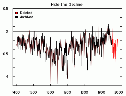
“Hide the decline” refers to the decline in the Briffa MXD temperature reconstruction in the last half of the 20th century, a decline that called into question the validity of the tree ring reconstructions. (I’m going to analyze the letters on another occasion.) In the IPCC Third and Fourth Assessment Reports, IPCC “hid the decline” by simply deleting the post-1960 values of the troublesome Briffa reconstruction – an artifice that Gavin Schmidt characterizes as an “a good way to deal with a problem” and tells us that there is “nothing problematic” about such an artifice (see here.
Not only were the post-1960 values of the Briffa reconstruction not shown in the IPCC 2001 report – an artifice that Gavin describes as being “hidden in plain sight”, they were deleted from the archived version of the reconstruction at NOAA here (note: the earlier Briffa 2000 data here does contain a related series through to 1994.)
Here’s the graph, with the decline added back in.

Wow, look at that decline that somehow wasn’t included in the graphs made the global warming alarmists. Did they use a trick to hide the decline?
Hide the decline
And here’s a catchy video to help you remember all of this. (H/T Lex Communis)
The scary part is that two of my leftist friends still kept their faith in global warming after this scandal broke. It’s a religion, but one that is diconfirmed by the evidence.
Related posts
- Climate Research Unit servers hacked, e-mails made public
- Comparison of hockey stick graph data to a larger data set in the same area
- Government-funded research unit destroyed original climate data
- The state of the debate about catastrophic man-made global warming
- Peer-reviewed article in journal Science says solar activity impacts climate
- Famous UN IPCC hockey stick graph is based on cherry-picked data
- Princeton physics professor testifies to Senate about global warming
- Global warming advocates refuse to give their data to skeptics
- Peer-reviewed article in journal Science says prior ice melting caused by solar variation
- Oceans are not warming now
- Polar ice caps are not melting now
- Polar bear populations are not decreasing now
- Global warming is not caused by humans

One thought on “What happens to the hockey stick graph if you don’t hide the decline?”